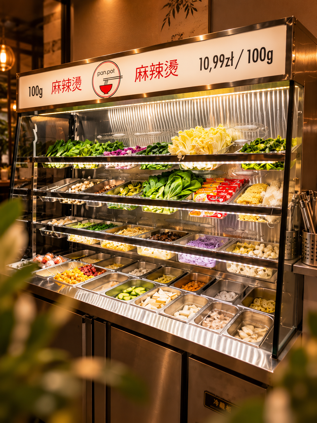
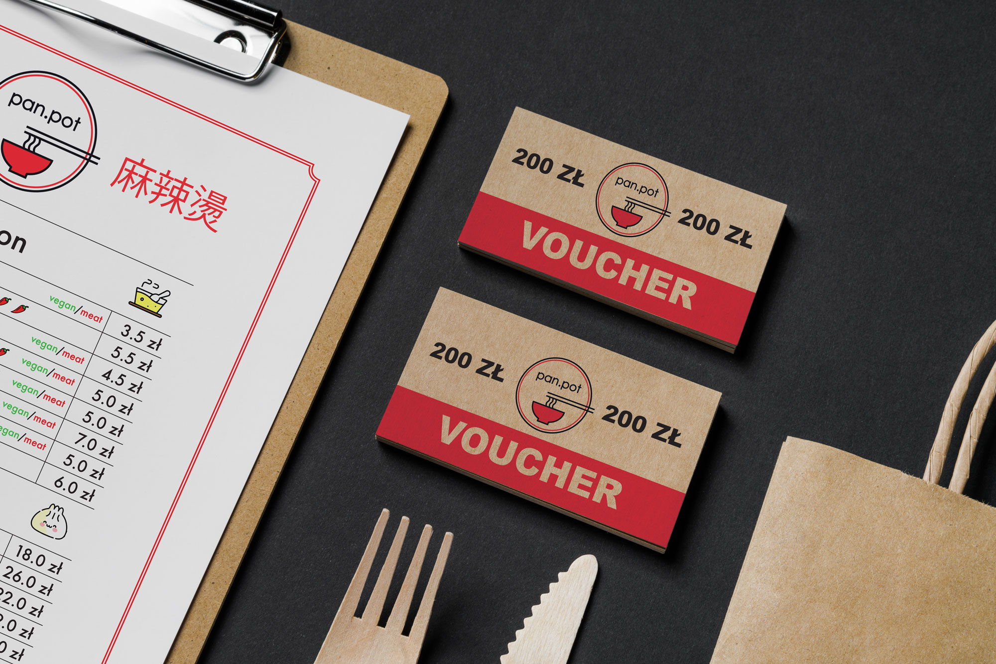
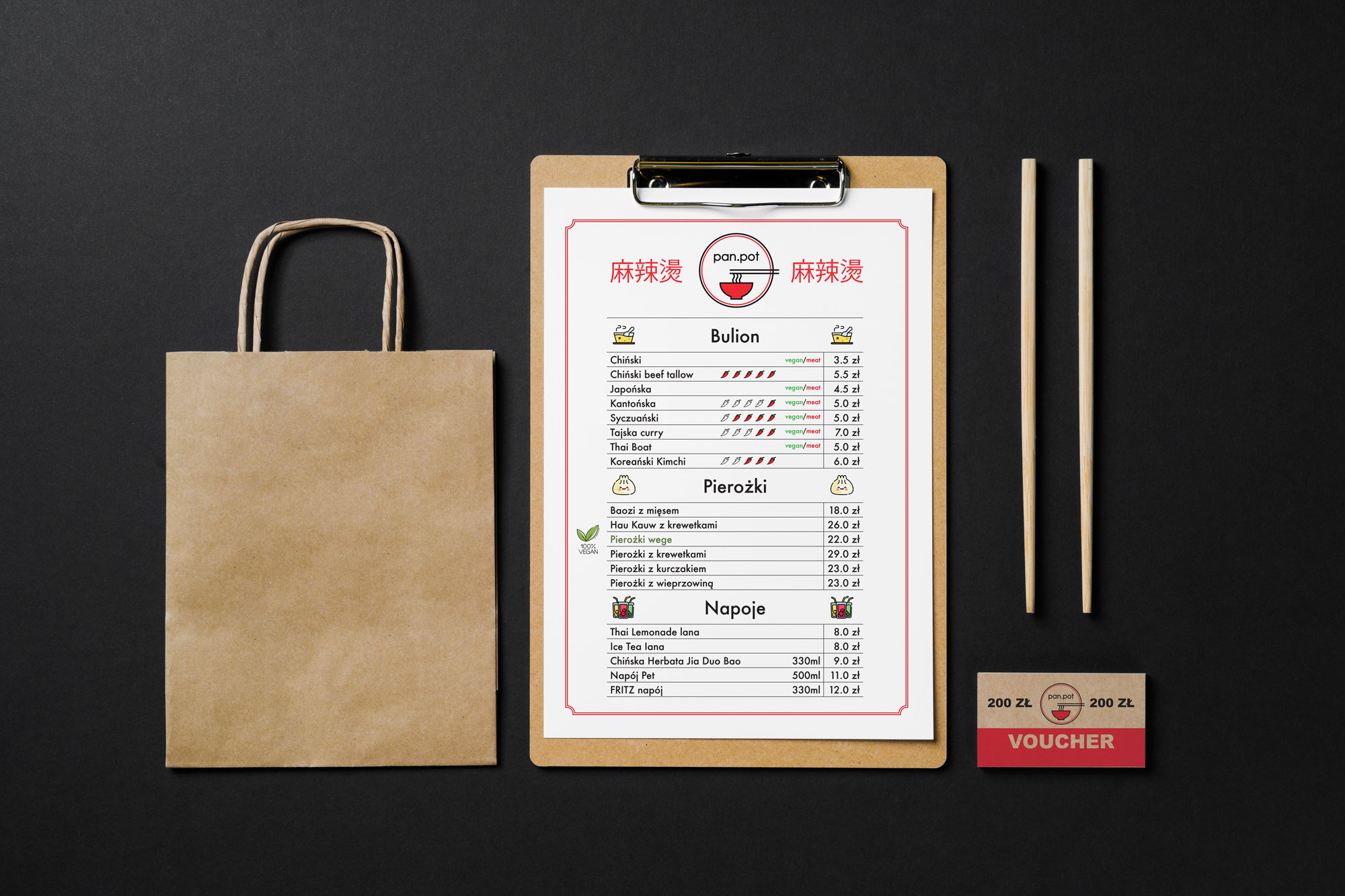
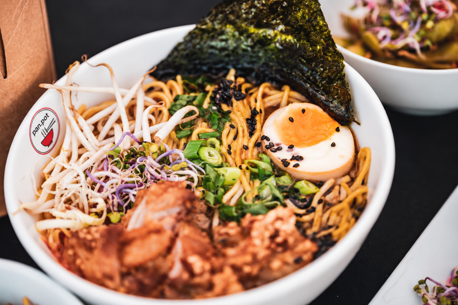
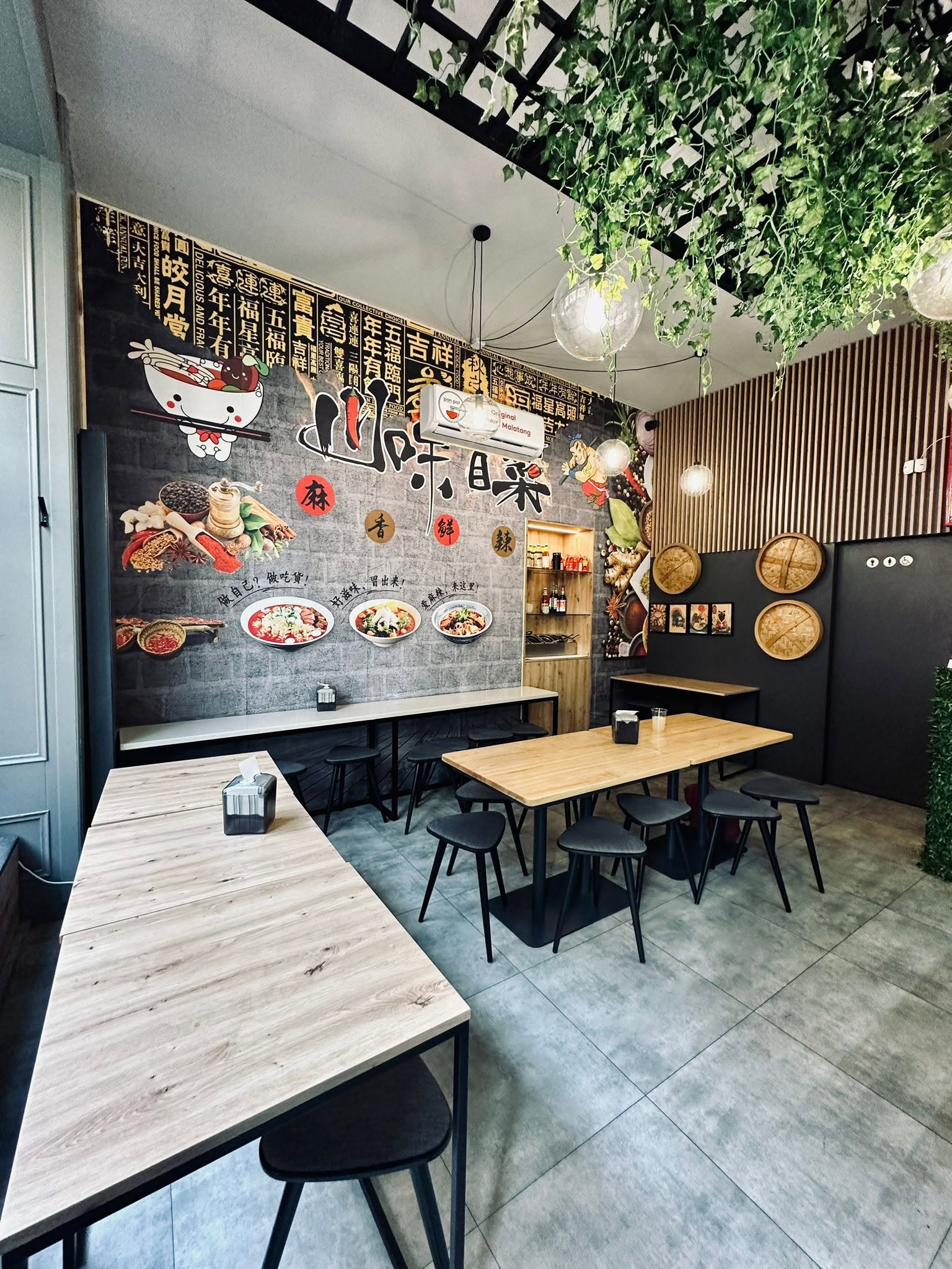
For Pan Pot, I focused on building a cohesive visual experience that brings together the restaurant’s distinctive character with functionality and attention to detail.
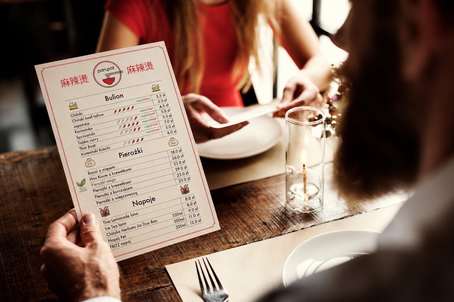
I approached Pan Pot by translating the restaurant’s character into practical, well-crafted materials. From menus to vouchers, every element was designed to maintain a clear and recognizable visual language.
Pan Pot allowed me to explore how thoughtful design can strengthen a restaurant’s identity through everyday materials, turning each detail into a natural extension of the brand experience.
Conclusion
I believe the strength of a restaurant brand lies in the details people interact with every day. For Pan Pot, I focused on combining visual consistency with practical design to make each printed piece feel like part of one experience.