Loading...
Muawad Design
© muawaddesign 2026.

Winnica Ragosza

From an old farmyard to a vineyard —
turning history into identity.
Client
Hanna i Wiesław Maślankowscy
Category
Brand Identity

Branding & Label Design

Sometimes the best stories are already there. You just have to look closely enough to find them.

Winnica Ragosza is a family-owned vineyard founded by Hanna and Wiesław Maślankowski in 2016, in Zachowice near Wrocław. Today, the vineyard covers around 1.2 hectares and grows several grape varieties, including Riesling, Chardonnay, Pinot Noir, Cabernet Sauvignon and Sauvignon Blanc. But when I started working on the identity, I wasn't looking only at the vineyard itself.

I was looking at what had been there before.

The story behind the mark

Before the vines appeared, the place had a completely different life.

The land was once associated with the breeding of chickens and roosters. This seemingly ordinary detail became the starting point for the visual concept.

Instead of treating the past as something to hide, I decided to make it part of the brand story.

The rooster became a subtle reference to the history of the place — transformed from a simple farmyard symbol into a distinctive visual element of the identity.

The idea was not to create a literal illustration of a bird. It was about finding a more refined connection between the old and the new: the history of the land and the vineyard that exists there today.

From farm to vineyard

That contrast became the heart of the identity.

A place that once lived by raising chickens was transformed into a family vineyard producing its own wines. The logo therefore became more than a name — it became a small piece of the place's history.

I wanted the identity to feel authentic rather than traditionally "wine-like". No obvious grapes, vines or generic heraldic symbols. Instead, the visual language draws from the unexpected story behind the location.

The logotype

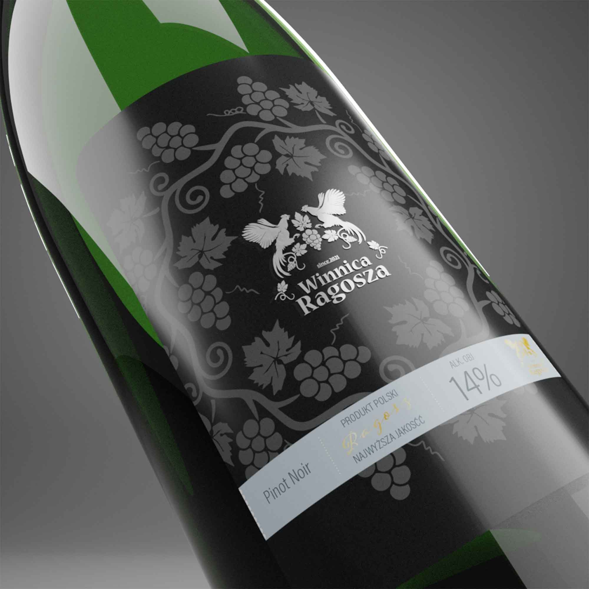
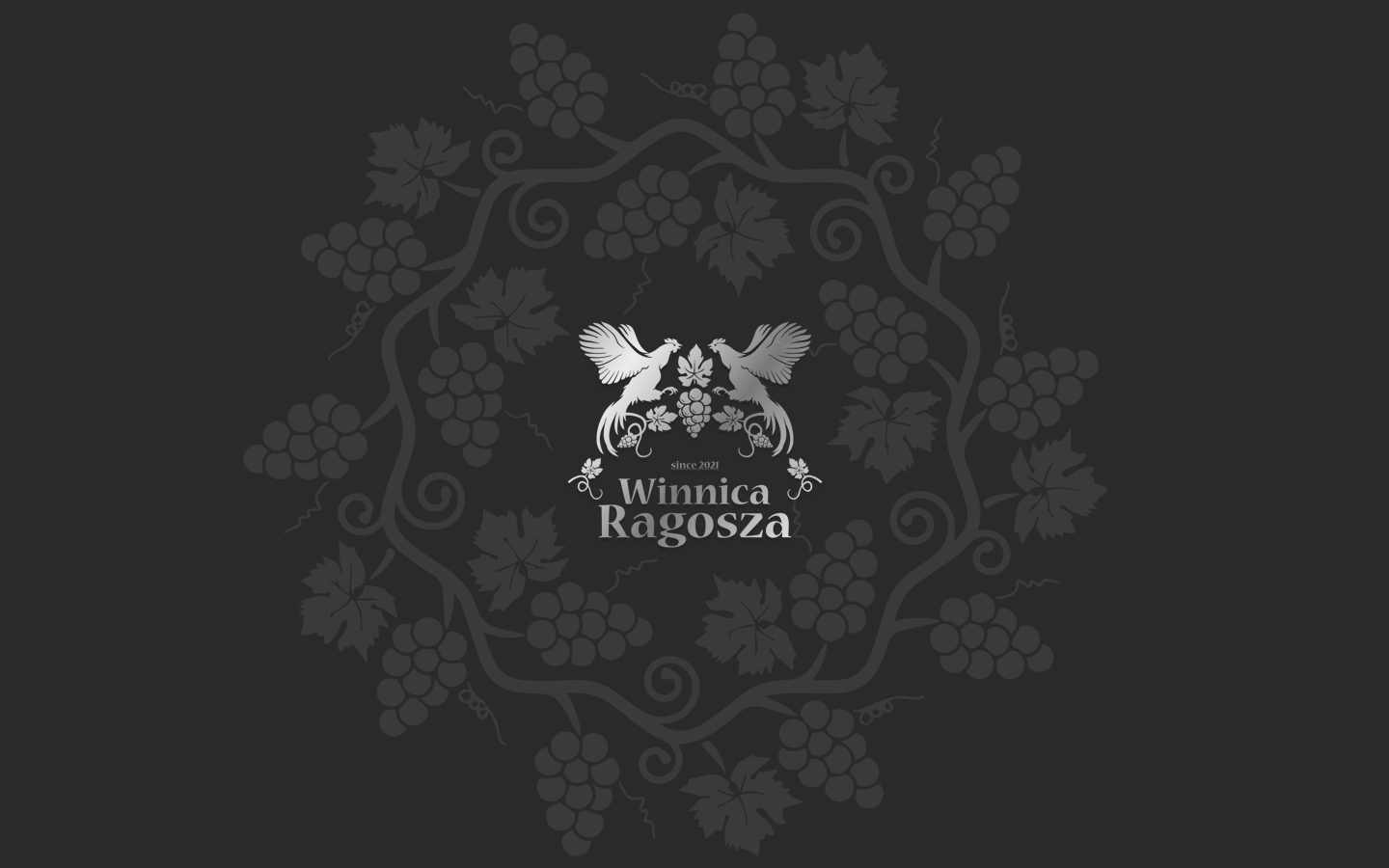
The logotype combines the name Ragosza with a distinctive symbol inspired by the site's history.

The form was designed to work as both a recognizable brand mark and a subtle storytelling device. At first glance, it works as an elegant identity for a wine producer. Look closer, and the connection to the place begins to reveal itself.

This was particularly important to me: the story shouldn't have to be explained before the identity works.

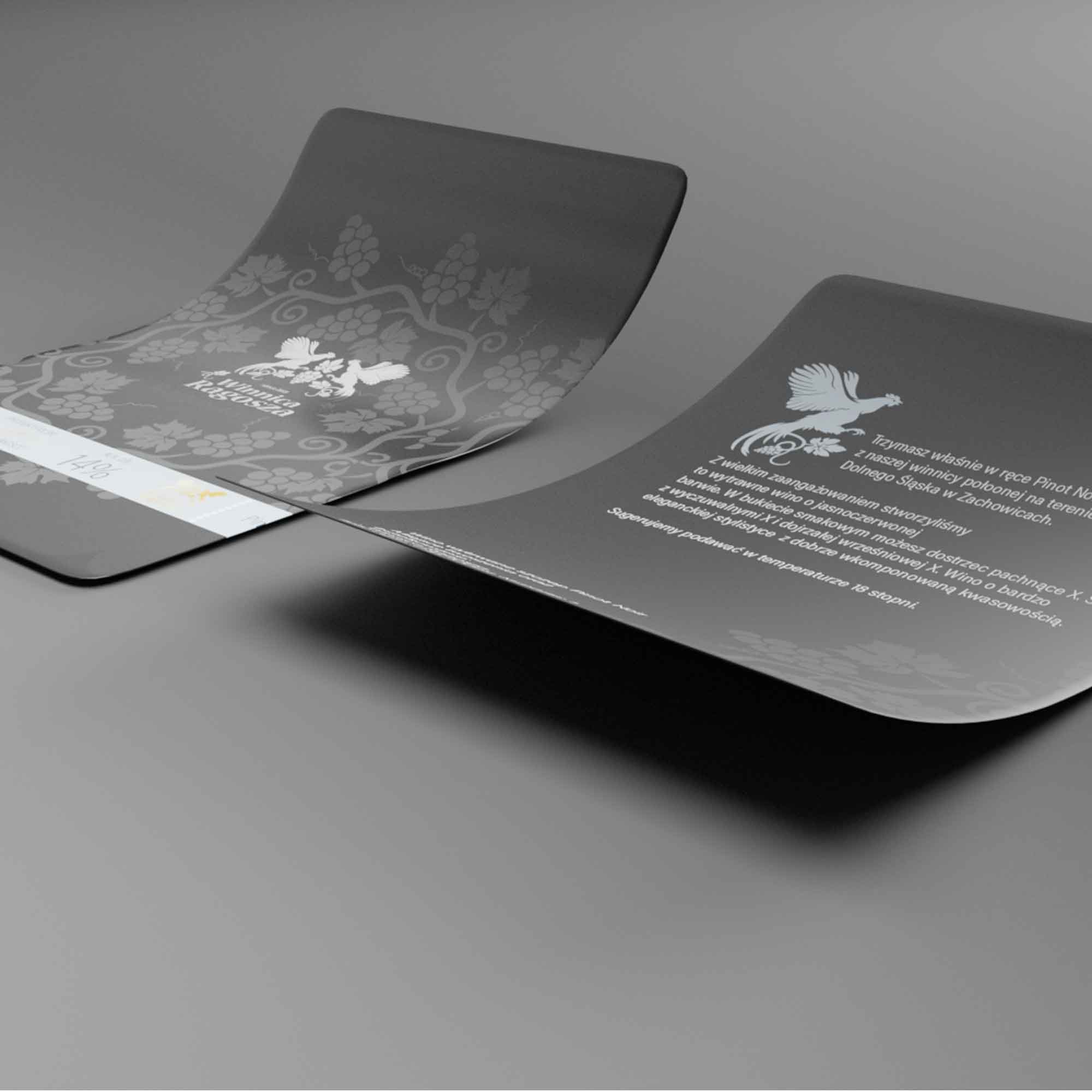
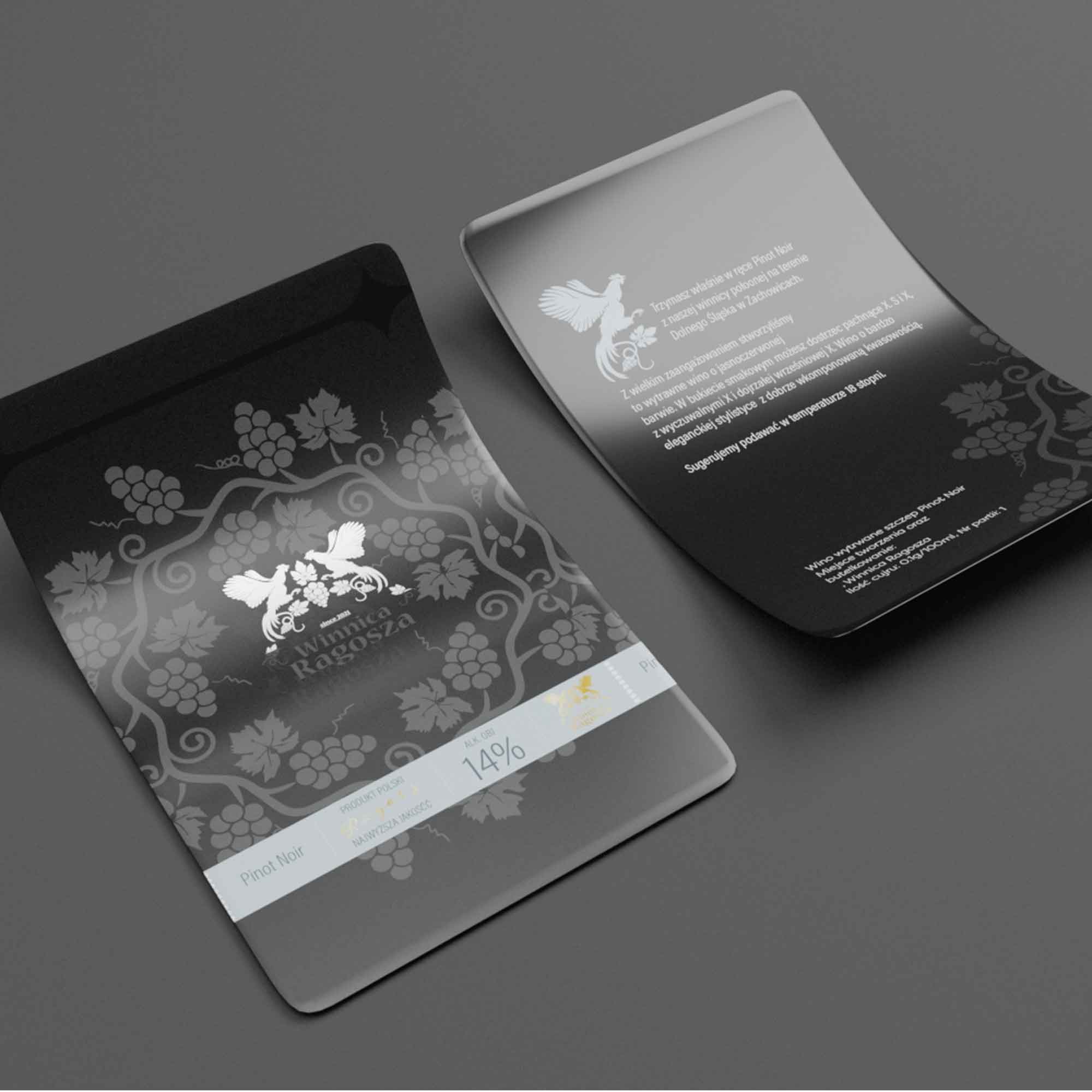
The label

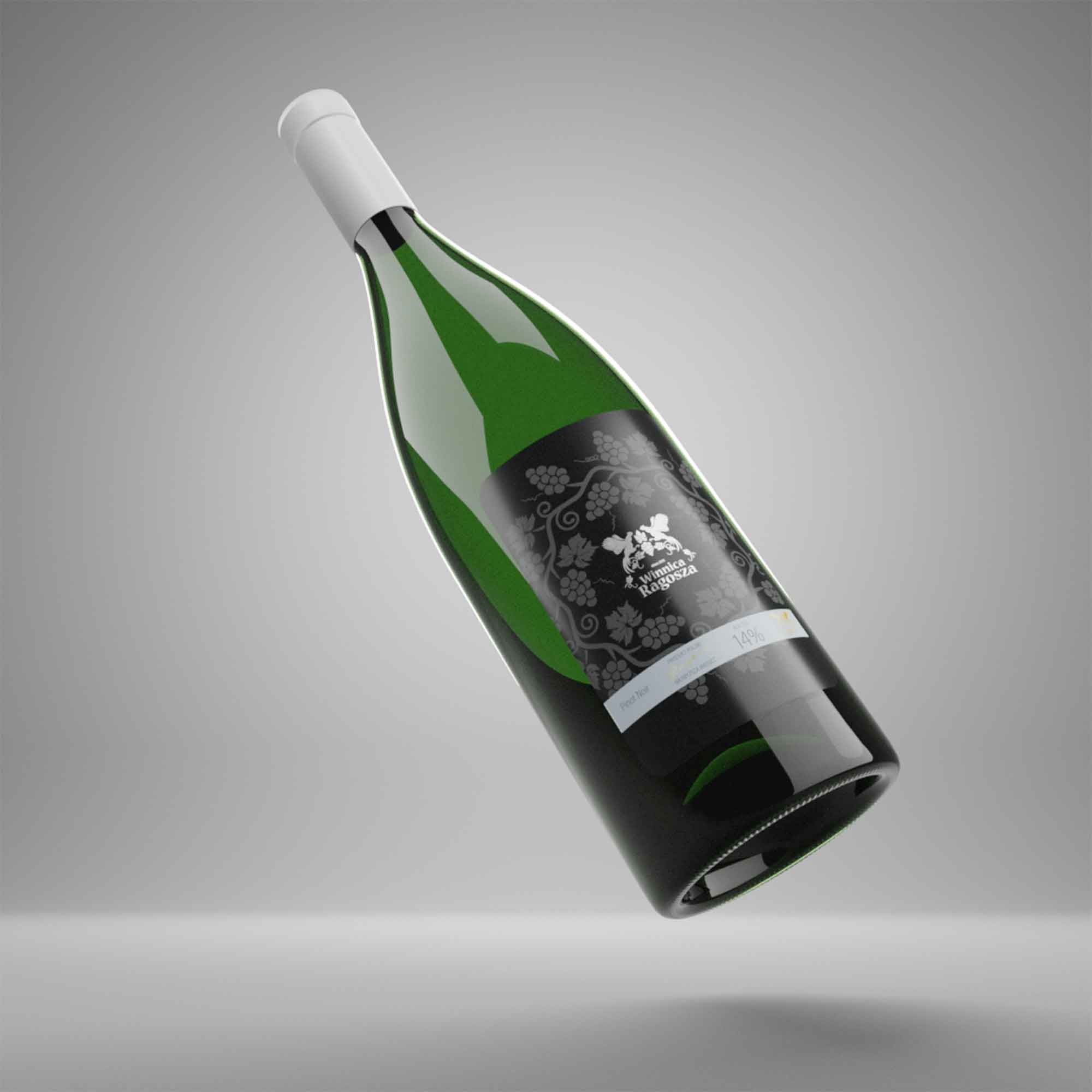
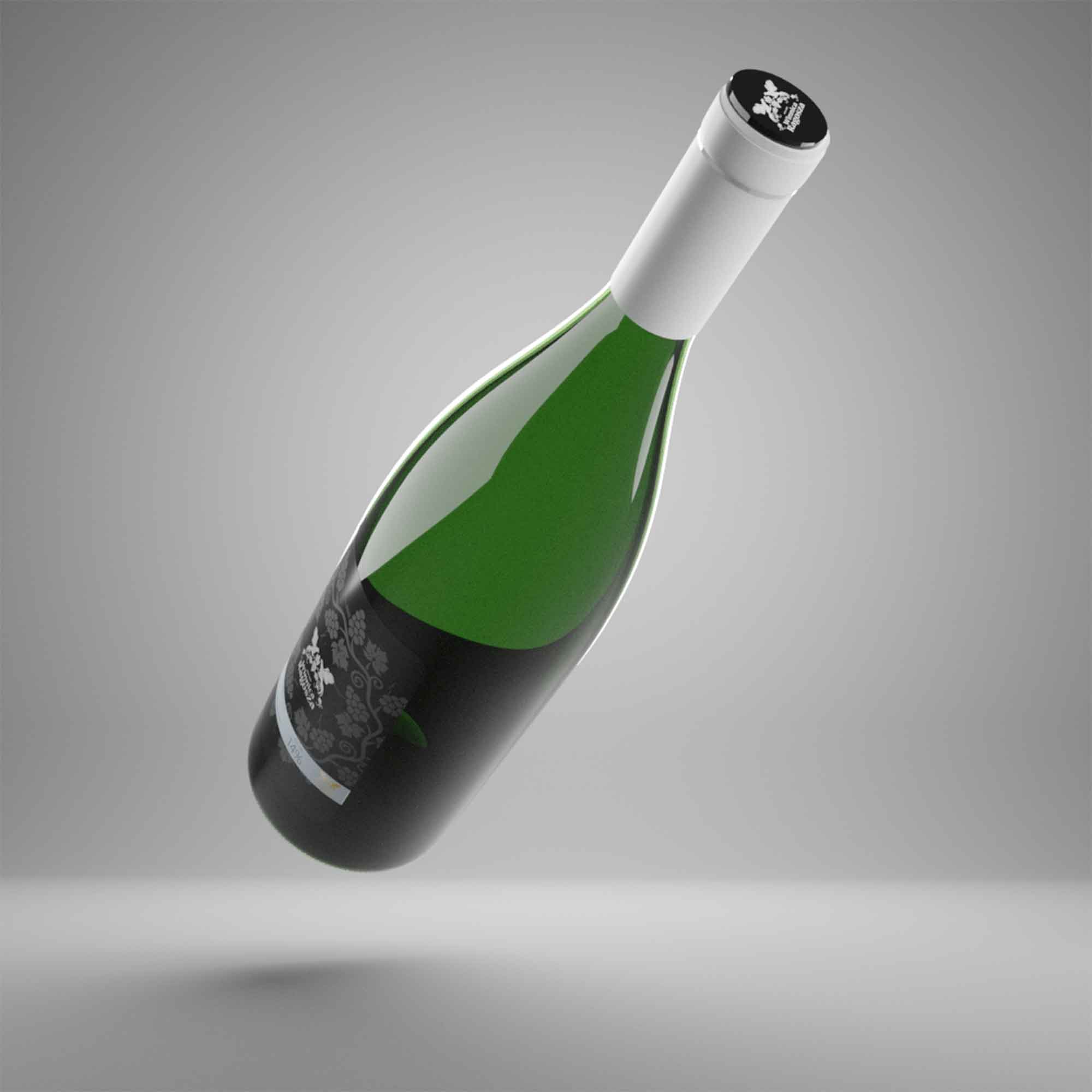
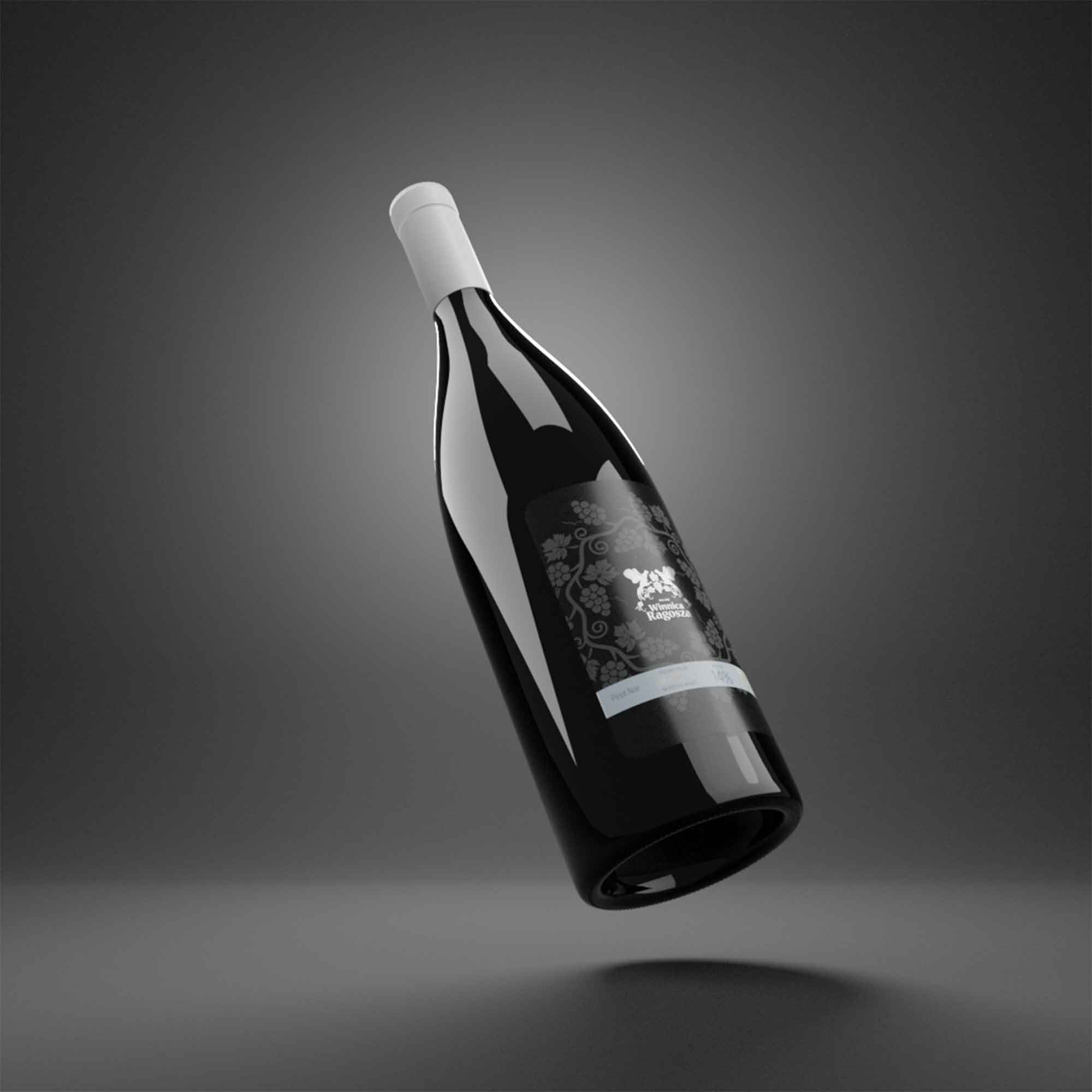
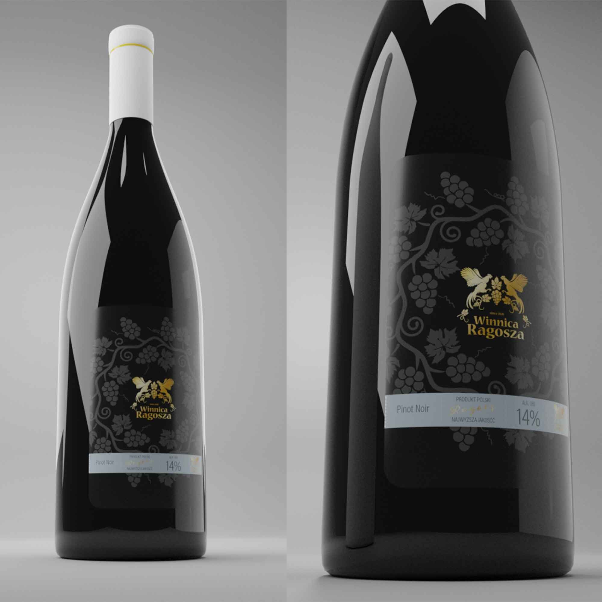
The bottle label became the natural extension of the identity.

I approached it as packaging rather than simply a decorative surface. Typography, proportions and information hierarchy were carefully balanced to create a label that feels refined while retaining the character of the brand.

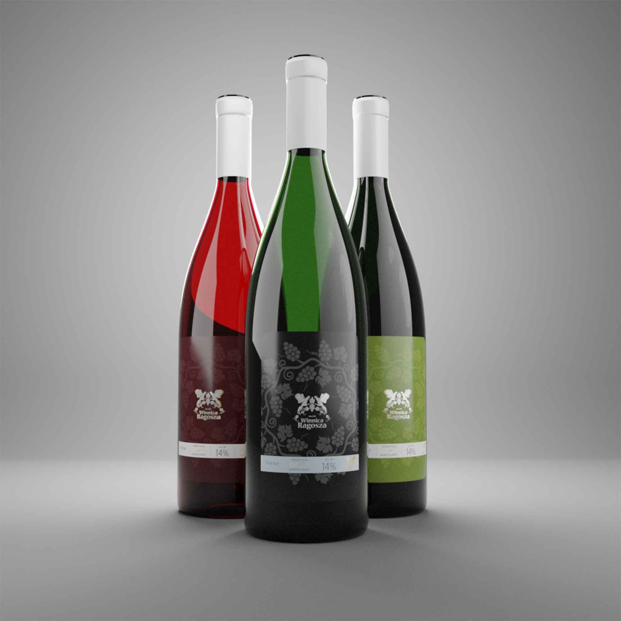
The system was designed to work across different wines and varieties, giving the collection a consistent visual language while allowing each bottle to retain its own identity.

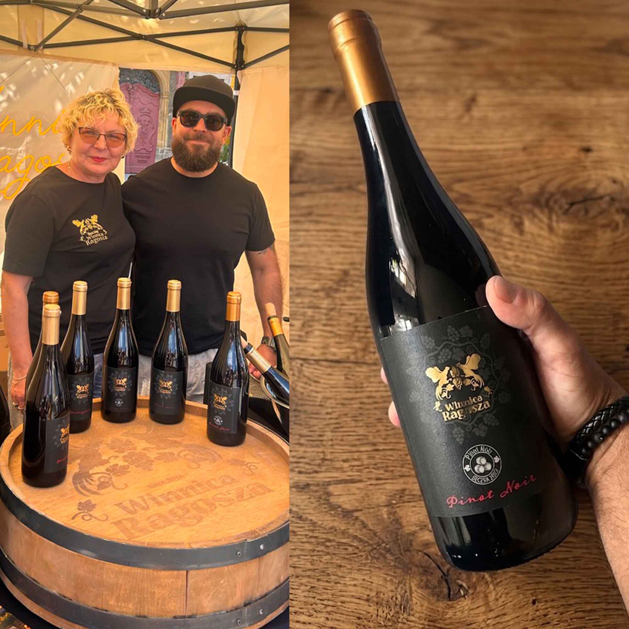
Today, Ragosza produces wines from a range of classic grape varieties, including Riesling, Chardonnay, Pinot Noir, Cabernet Sauvignon, Sauvignon Blanc and Portugieser.
A story you can hold

The final identity brings together two seemingly distant chapters of the same place.

The old story of the farmyard.

And the new story of the vineyard.

The logo, labels and packaging turn that transition into a visual narrative — one that connects the history of the land with what is being created there today.

Because sometimes a brand doesn't need to invent a story.

Sometimes, the best story is already growing there.

Conclusion

What sets me apart is not just my technical expertise but also my commitment to sharing great ideas that elevate the digital presence of my clients. I believe that collaboration and creativity are the cornerstones of progress, and I am dedicated to bringing a fresh perspective to every project.

© Muawad Design 2026. All rights reserved.